Client
Practice Fusion
Dashboard
Practice Fusion
Client
Practice Fusion
Year
2024
Scope of Work
UI / UX
Location
Miami
Practice Fusion is an electronic health records platform used by healthcare providers to manage patient data, scheduling, and clinical workflows. This project focuses on improving the clarity and usability of key interface screens by addressing issues in hierarchy, consistency, and information structure.
Redesigning the EHR Experience
The previous interface presented a high volume of patient data, making efficient scanning critical. However, key information competed for attention, making it difficult to quickly determine which patients required attention. The redesign introduced a clearer hierarchy, making key information easier to scan and interpret.
Where the UI Breaks Down
I reviewed the existing UI components and patterns to understand where the experience breaks down.The audit revealed inconsistencies, unnecessary visual noise, and patterns that made the interface harder to scan and use.
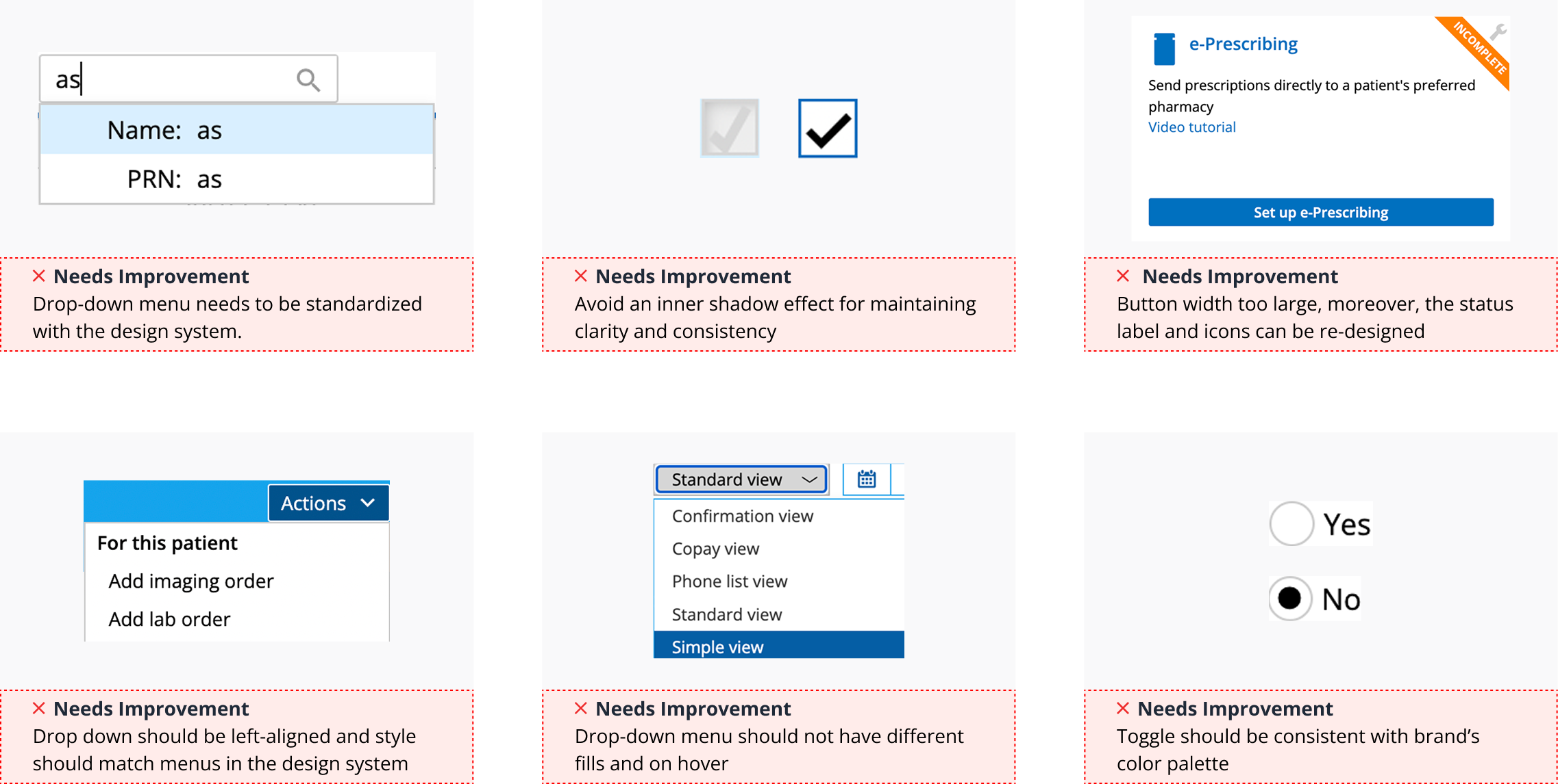
Previous Screens
Examples of the original interface showing inconsistent layouts and unclear status visibility and no clear grid system. These issues created friction in everyday workflows, particularly in high-frequency tasks like reviewing patient data and managing follow-ups.
Key Design Decisions
• Prioritized patient identity and status: Rows were restructured to surface identity and status.
• Introduced Status Badge system: Patient statuses were represented with visual badges.
• Standardized actions: Advanced filtering and actions buttons were aligned and positioned across rows.
• Introduced a consistent layout system: A grid and spacing system was applied to bring alignment across screens.
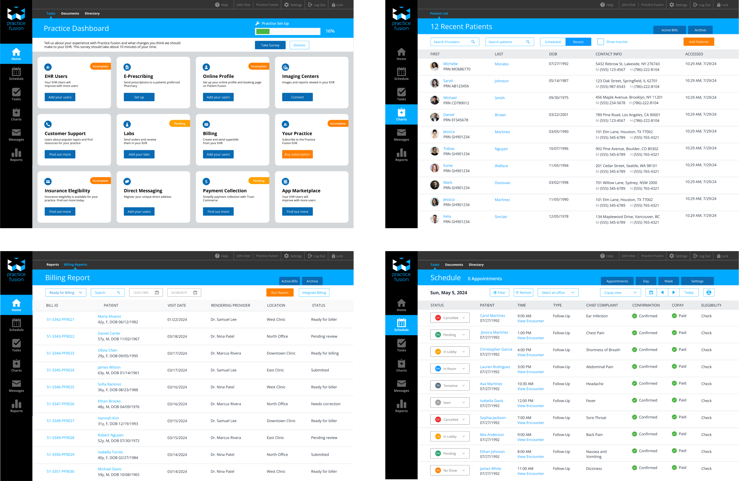
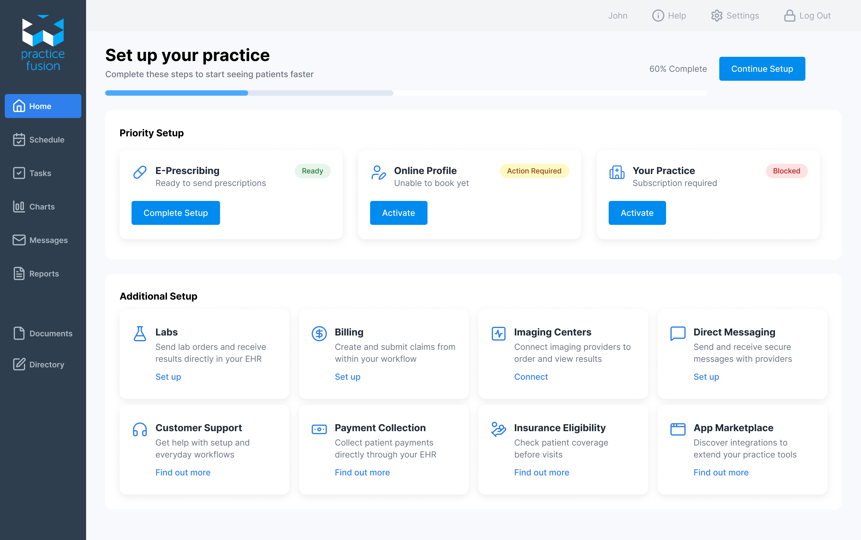
Guided Setup with Clear Progress
In addition to introducing a grid system, I implemented a unified icon set using Lucide, improving clarity and creating a more cohesive interface.
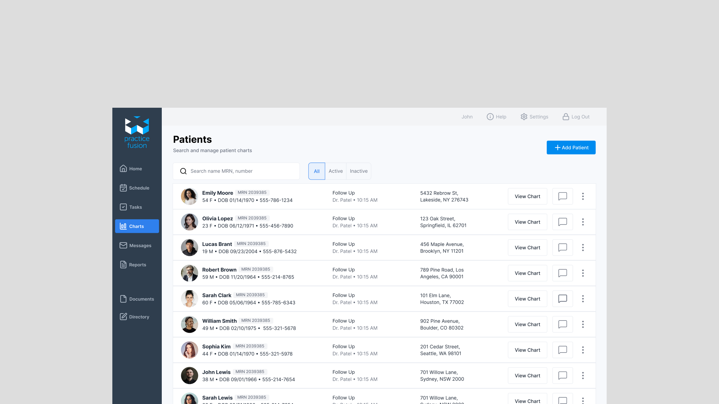
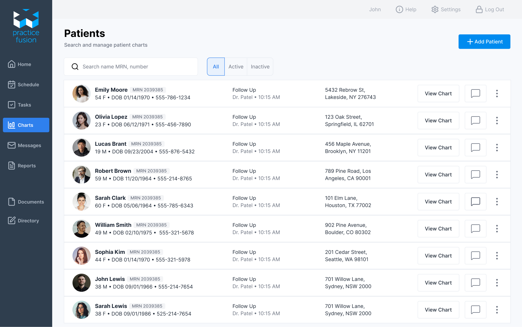
Patient Charts — Simplified for Fast Scanning
Identity and status are surfaced first, with actions aligned consistently on the right.
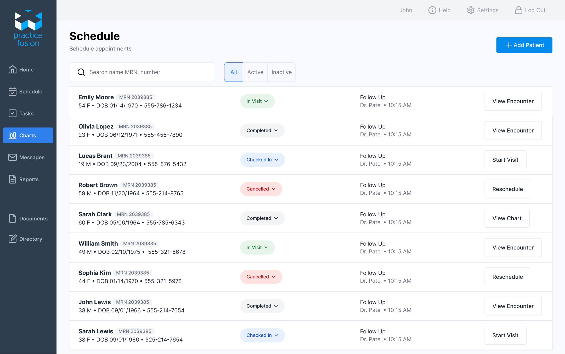
Scheduling with Clear Status and Actions
Here, I improved how appointment status and actions are displayed, making it easier to track patient progress and take the next step without confusion or extra clicks. I left only the most important information and simplified patient metadata to be displayed in one column.
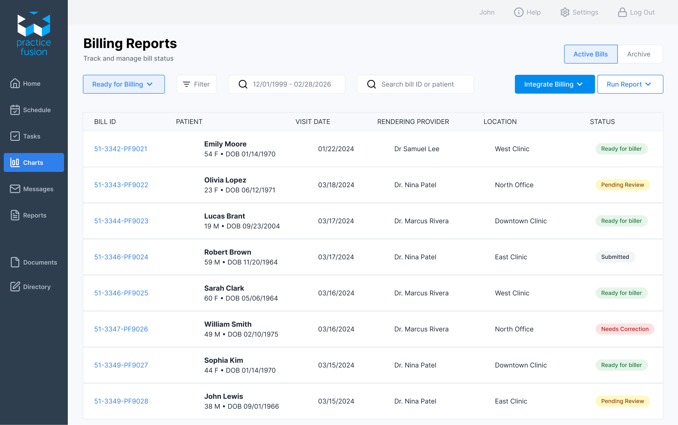
Billing Reports
The original screen was difficult to scan and relied on plain text for key states. I introduced status badges to make important information stand out and move through billing tasks more efficiently.
What I learned
Working on Practice Fusion made it clear how much small usability issues slow down everyday workflows. I restructured the billing screen to improve scanability and introduced clearer status indicators so it’s easier to quickly understand what needs attention. This reduces the effort required to review each bill and helps users move through tasks more efficiently. It reinforced that in systems like Practice Fusion, the real impact comes from making workflows clearer and faster, not from adding more features.