Concept
Dashboard
Mobile App
MODIFI
Client
MODIFI
Year
2022
Scope of Work
UI / UX
Location
Berlin
This project highlighted how structured hierarchy and real-time visual feedback can significantly reduce cognitive load in data-heavy environments. Clear prioritization of trade value, status, and limit usage enabled faster, more proactive decision-making.
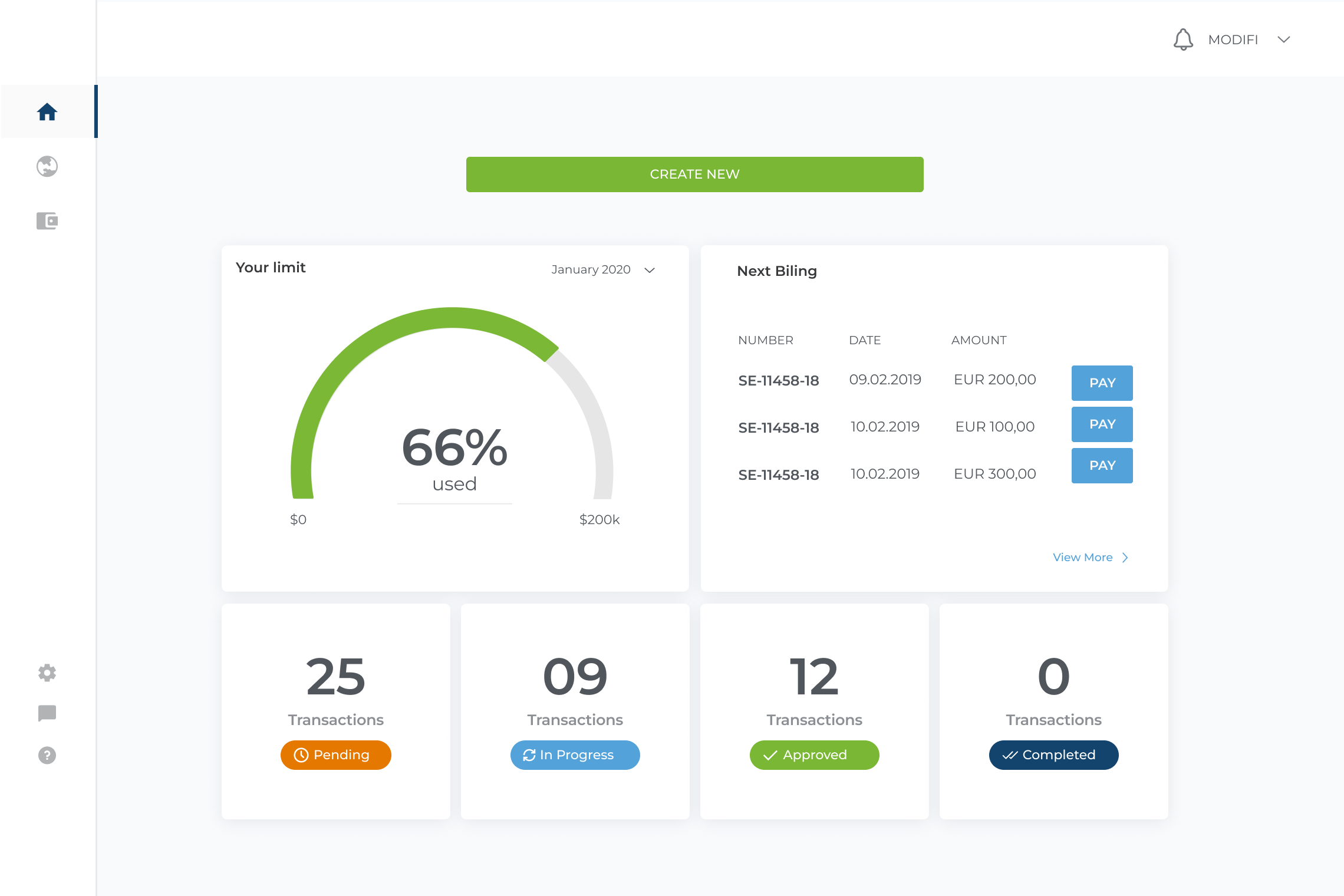
Limited Visibility of Repayments
Previous Dashboard Design
On the main overview screen, repayment information was not clearly prioritized. While users could see their credit usage, upcoming payments were pushed into secondary panels with low visual hierarchy. Important details like due dates and amounts required extra effort to scan, and there was no strong indication of urgency. As a result, users could easily overlook time-sensitive repayments, reducing their ability to proactively manage their credit.
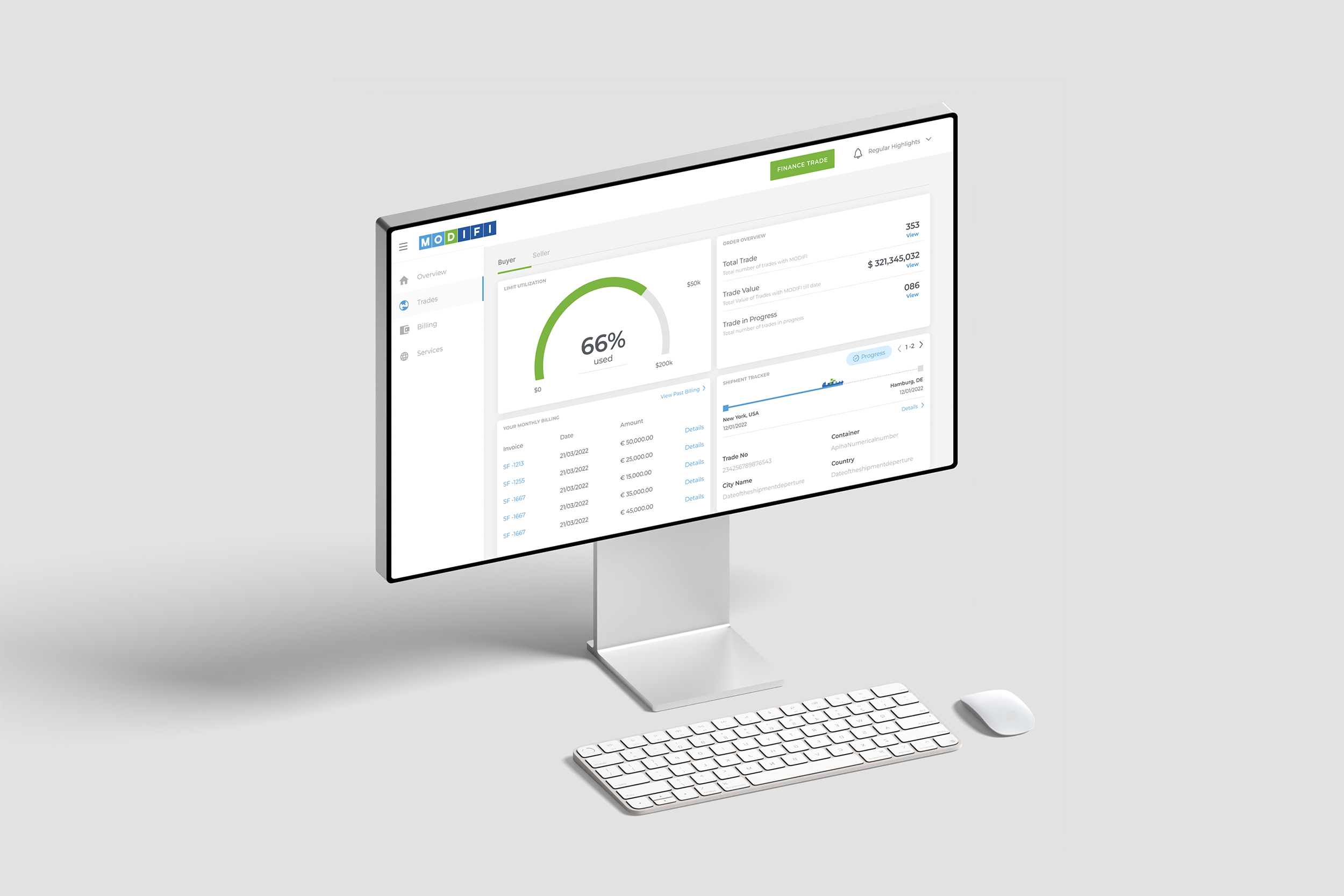
Dashboard Redesign
Based on stakeholder feedback and user needs, the final dashboard design needed to introduce a more clear, structured overview that brings together shipment tracking, repayments, monthly billing, and overall trade value in one unified experience.
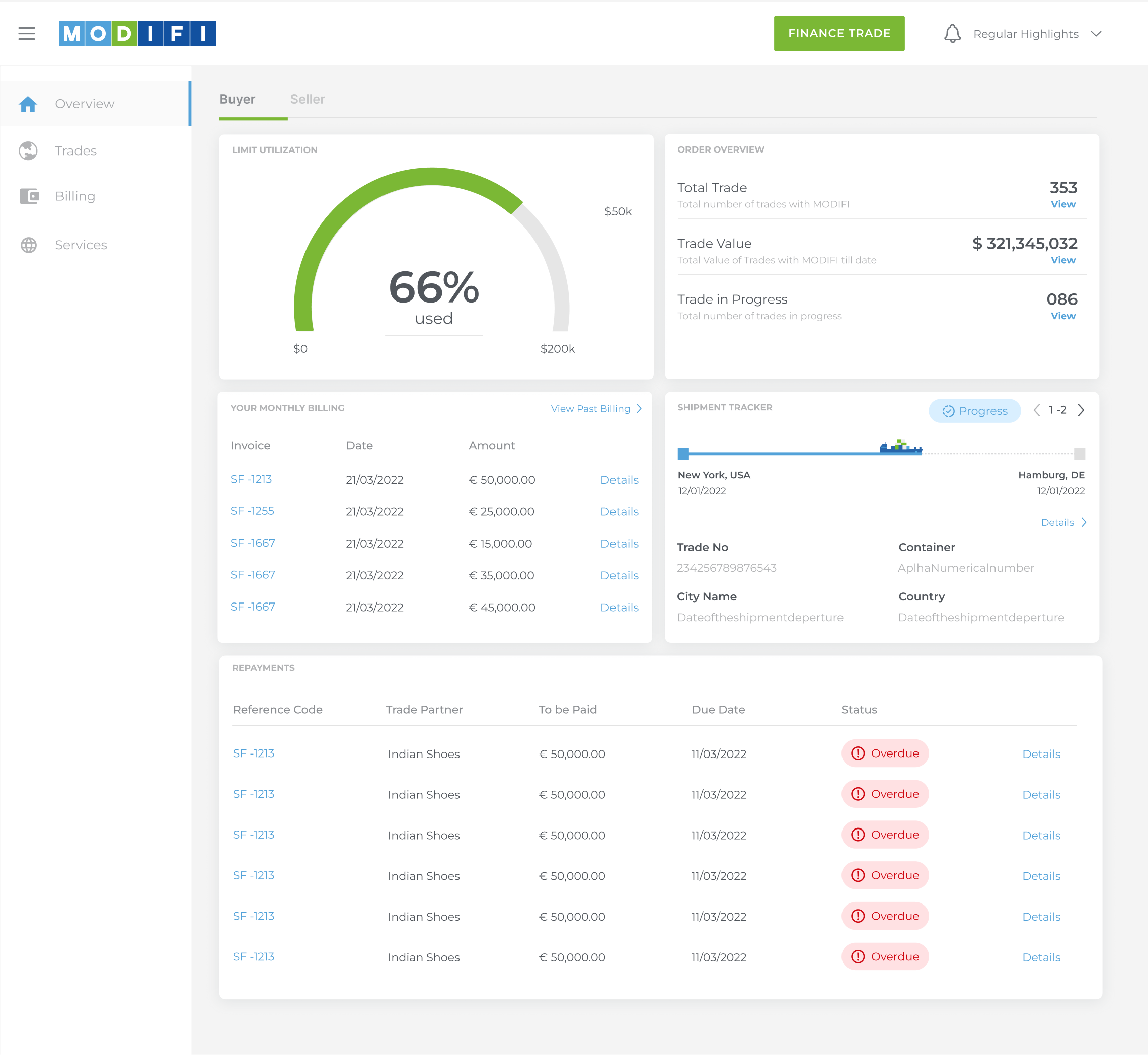
Shipment Tracker View
Also improved the Shipment Tracker view to give users clearer visibility into their shipments, making it easier to manage multiple active orders without friction.
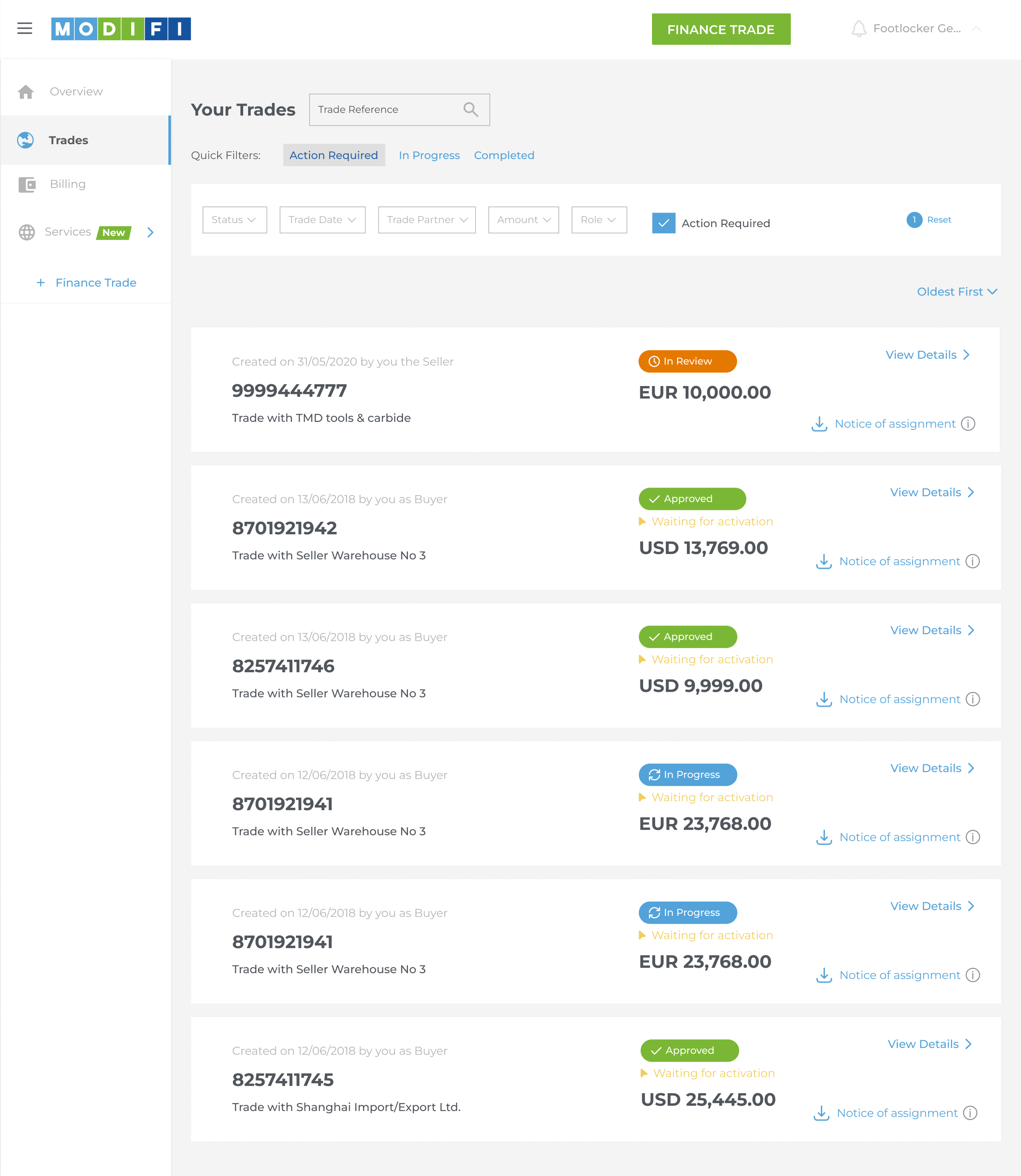
Trade View
The Trades view was improved to provide a clear, focused overview of each trade without overwhelming the user. Key details like trade value, buyer information, shipment status, and payment progress are consolidated into a single, easy-to-scan layout.
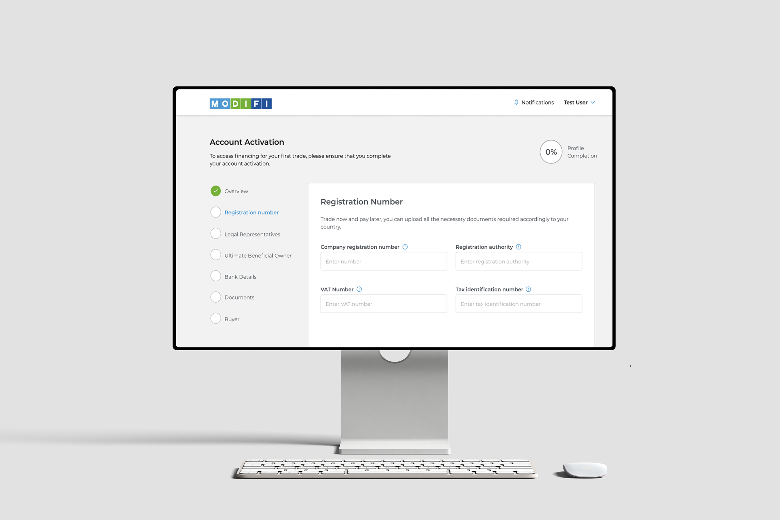
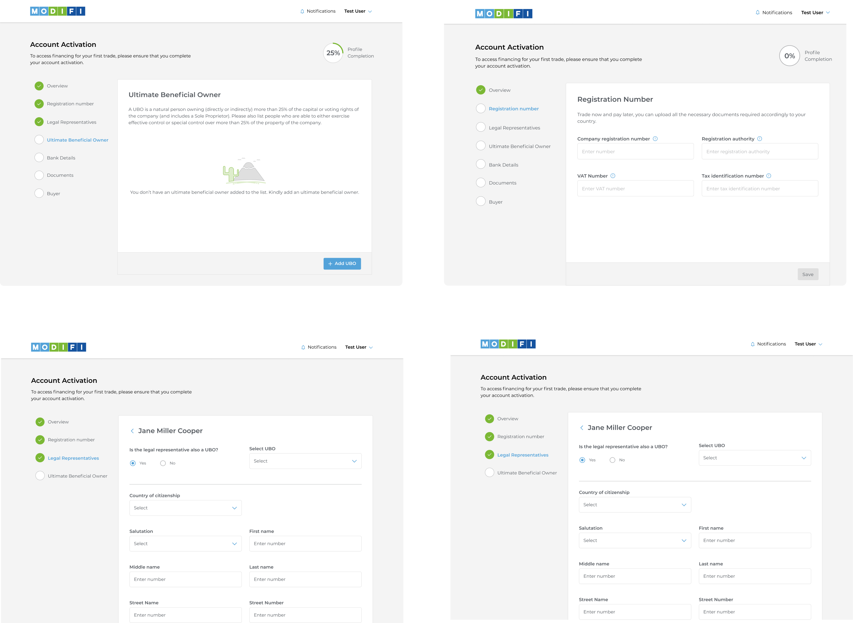
Account Activation Screens
These screens support users through the final stage of onboarding by clearly showing account status and outlining next steps, reducing uncertainty during activation.
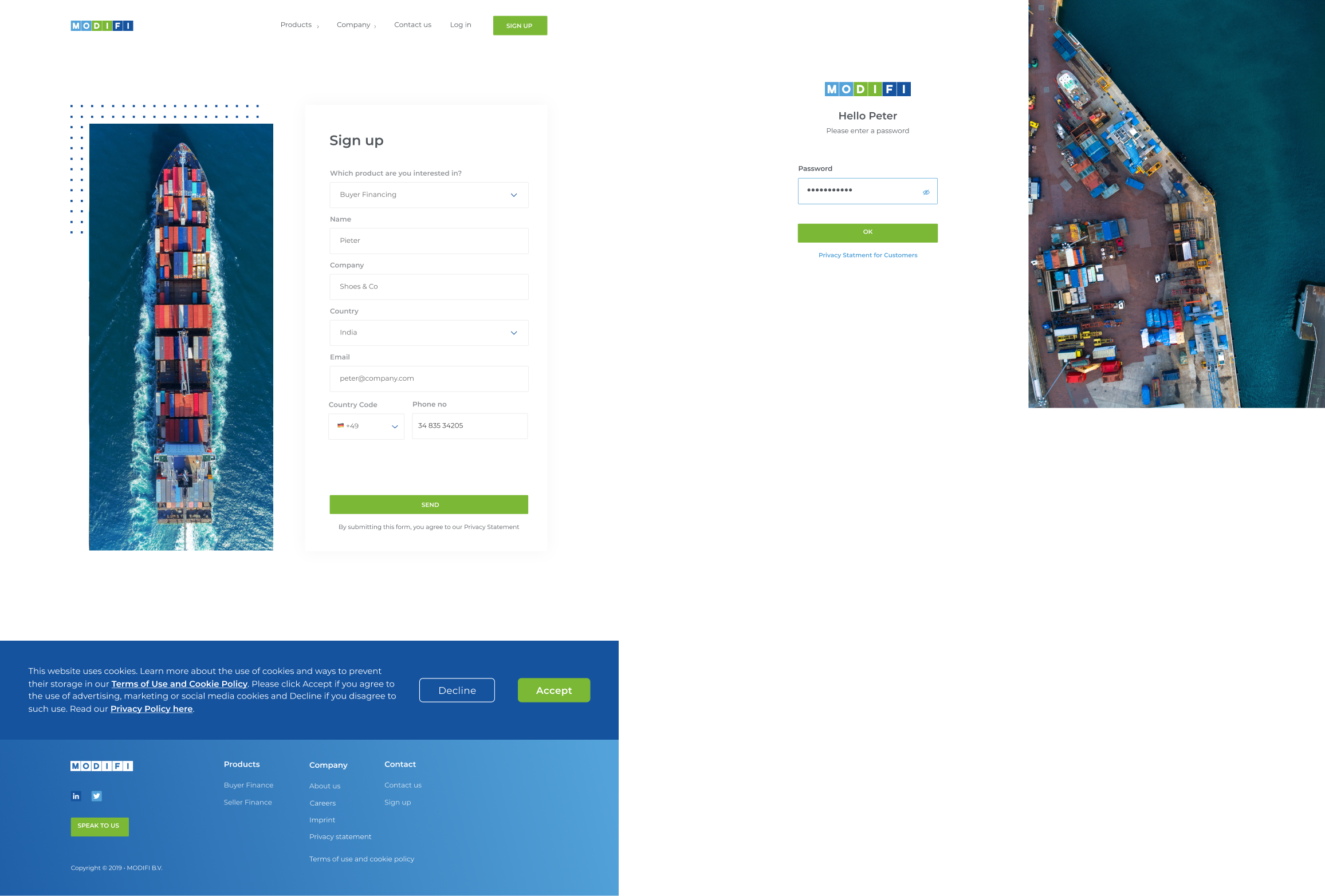
Sign Up
After completing registration, users are directed to their dashboard, where they can immediately view account information, trade activity, and available services.