Mobile App
Instawork
Client
Instawork
Year
2024
Scope of Work
UI / UX
Location
Miami
Instawork connects businesses with flexible workers, but the experience of finding and applying to jobs wasn’t as seamless as it could be. Users were often overwhelmed by scattered listings, unclear filters, and a process that required more effort than necessary to complete simple actions.
Helping Workers Find and Choose Shifts Faster
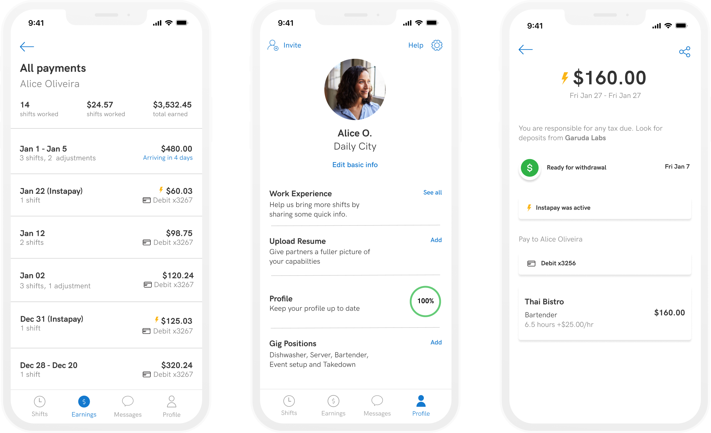
My Role
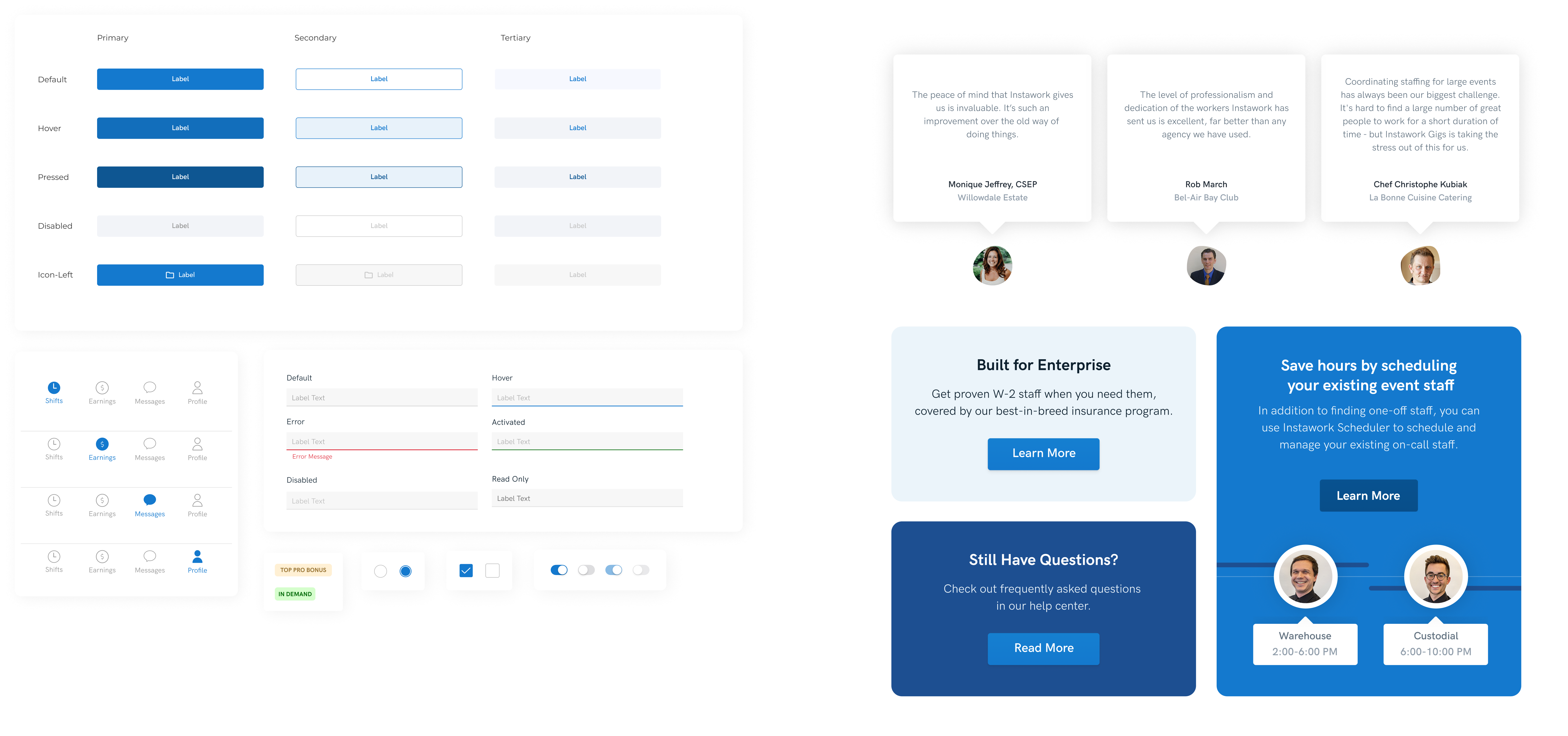
Evolving their Design System
Firstly, I refined their design system to create alignment across screens and reduce cognitive load. This allowed the booking flow to feel cohesive, predictable, and faster to complete. Some components we also used in their website.
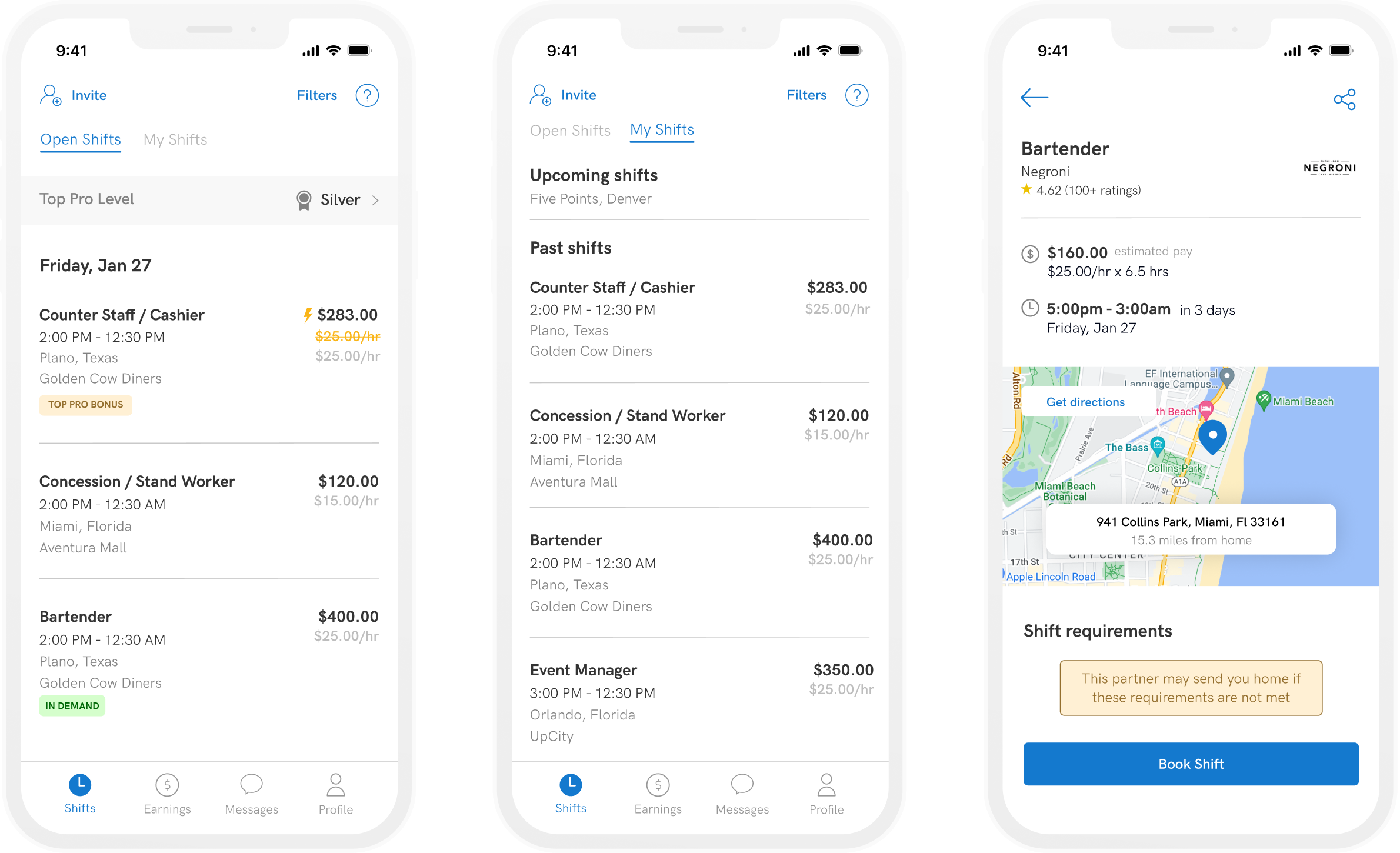
Simplifying Shift Discovery and Booking
Originally, the shift list made it hard to quickly compare opportunities, with pay, role, and location all competing for attention. I restructured the layout to make pay the main focus and simplified the hierarchy so each shift is easier to scan and quicker to evaluate. I also made signals like instant pay, bonuses, and demand more visible so users can spot better opportunities without having to read through everything.
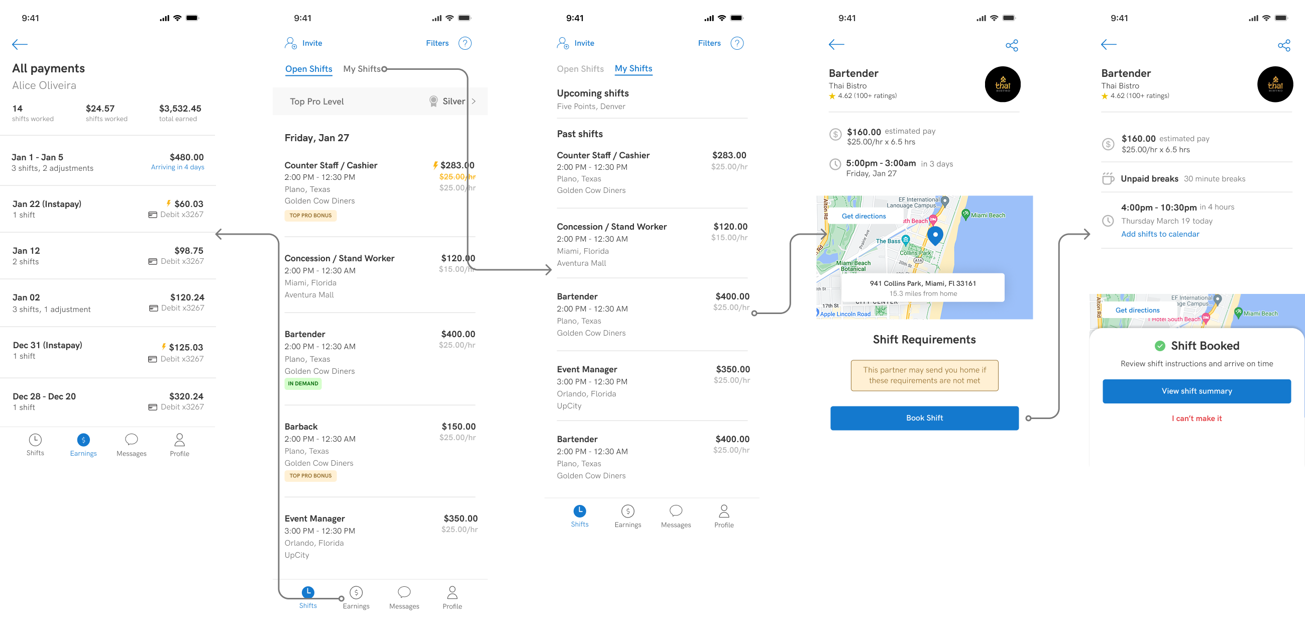
Clearer Visibility Into Earnings
Earnings are easy to scan at a glance, giving users a clear sense of what they’ve made, what’s pending, and what’s ready to withdraw. Payouts, bonuses, and payment status are organized in a way that reduces uncertainty and helps users stay on top of their income.
Improved Job Discovery
Job listings were made easier to scan, key information was surfaced upfront, and filters were reworked to feel more intuitive and accessible.
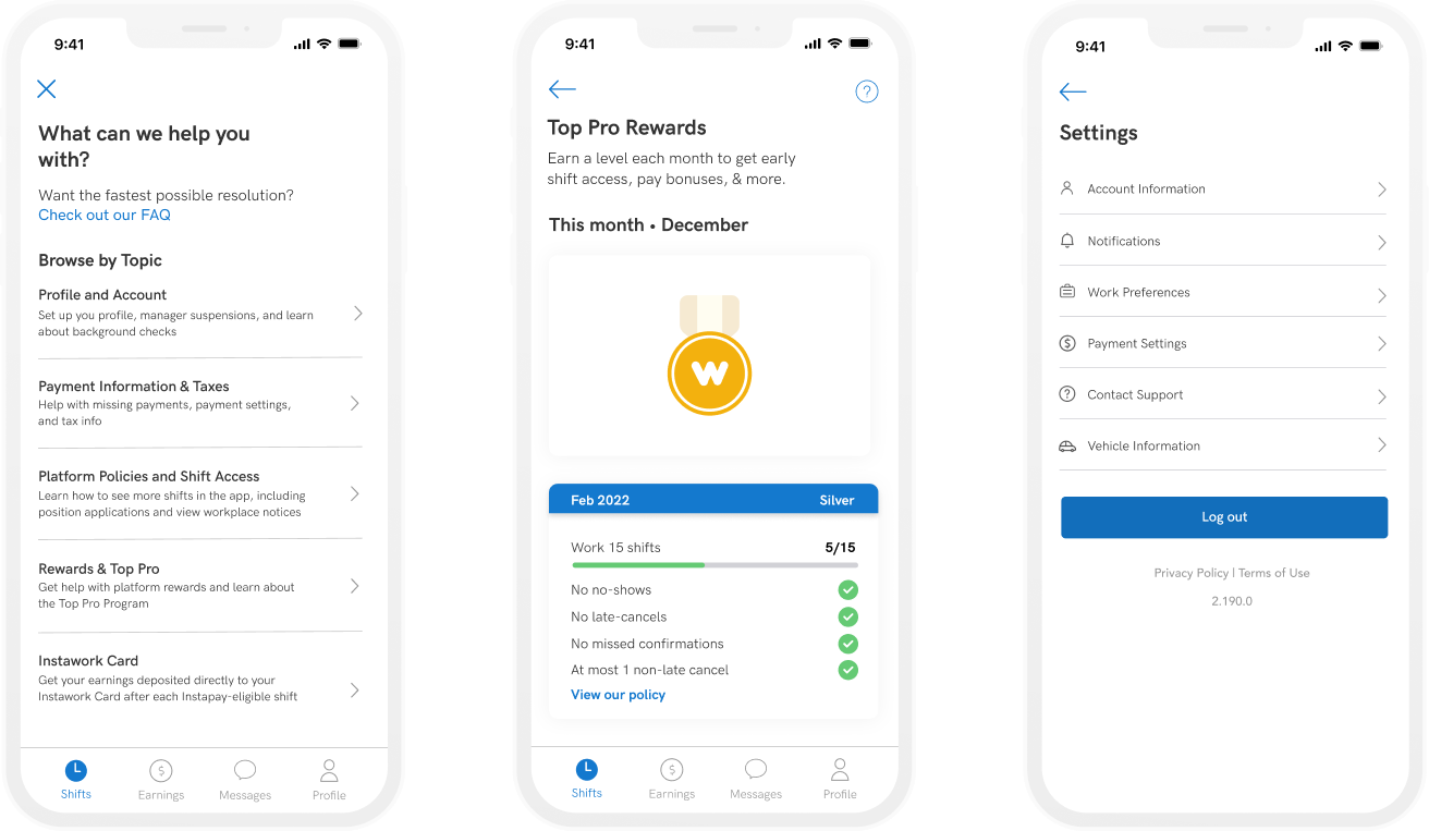
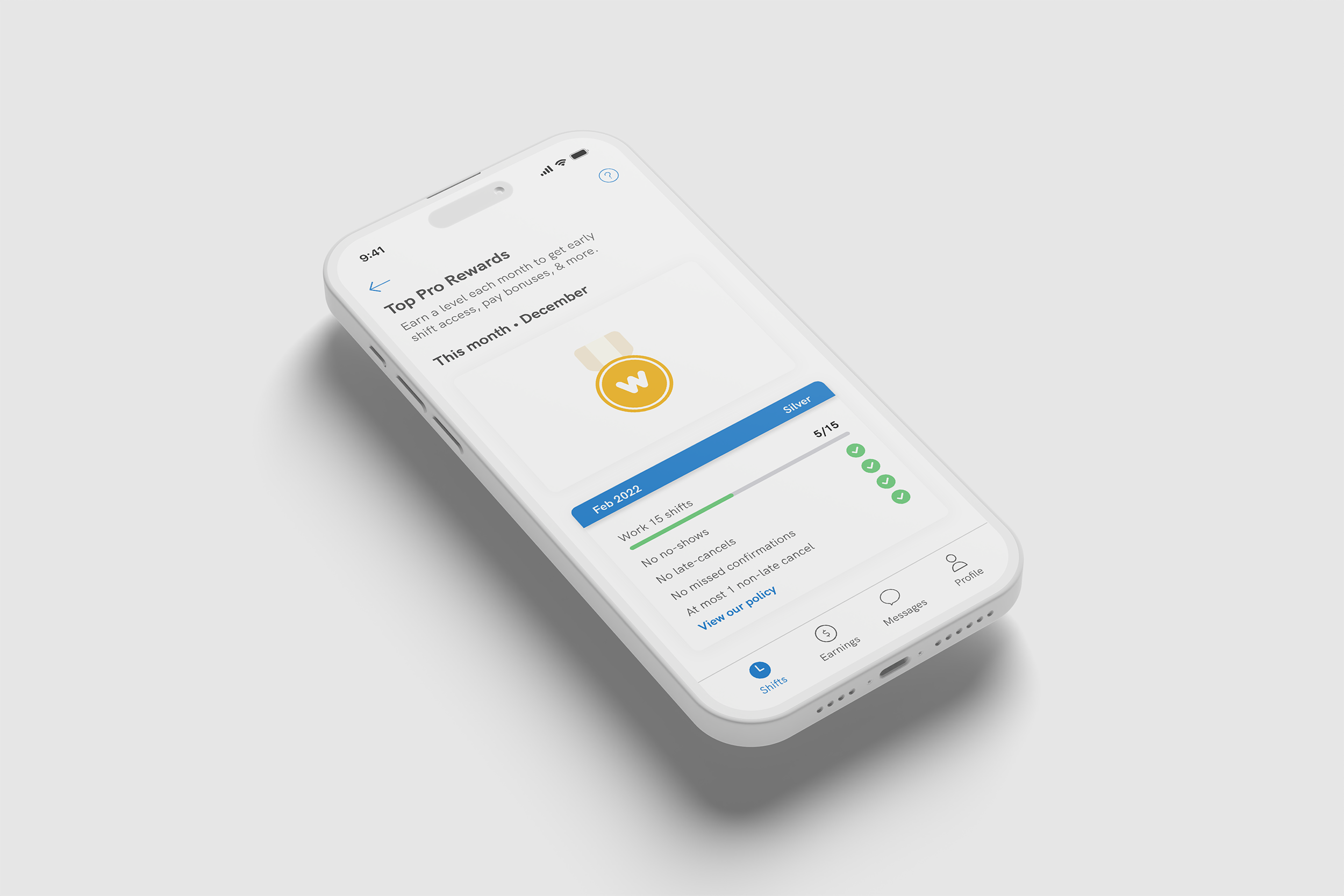
Incentivizing Consistent Performance
The rewards experience was redesigned to make progress easier to understand and more motivating. By connecting performance metrics like completed shifts and attendance to visible milestones, users can clearly see how consistency pays off.