Client
VIRA
Website
VIRA
Client
VIRA
Year
2024
Scope of Work
UI
Location
Florida
For this redesign, the emphasis was on the development of VIRA as the company moved into new industry areas by clearly articulating their new services to other users. I restructured and redesigned the way that VIRA’s products would be presented to the public.
The Problem
VIRA’s work is inherently cross-industry, they went on to expand to different industries but their website didn’t reflect that. Most content leaned heavily toward retail, making it difficult for potential clients in other industries to see how VIRA’s expertise applied to them. Projects were presented without enough context, and capabilities were described in a way that felt tied to specific use cases. As a result, the site undersold what VIRA actually did.
My Role
I led the redesign of the VIRA Insight website, focusing on making their retail expertise clearer while supporting their expansion into other industries. I audited the existing site and identified gaps in how their services were communicated. From there, I restructured the content and redesigned the UI to better guide users through what they offer and how they work.
Information Architecture
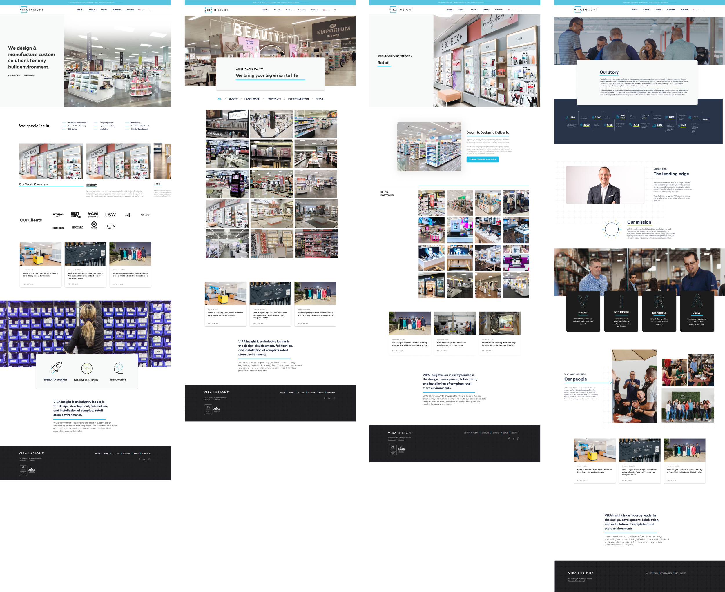
I mapped out the site structure to identify how to better expand the services and expanding industries. The biggest shift was reorganizing Work around industries, making it easier to explore relevant projects and see how VIRA’s capabilities apply across different contexts.

Structuring Work by Industry
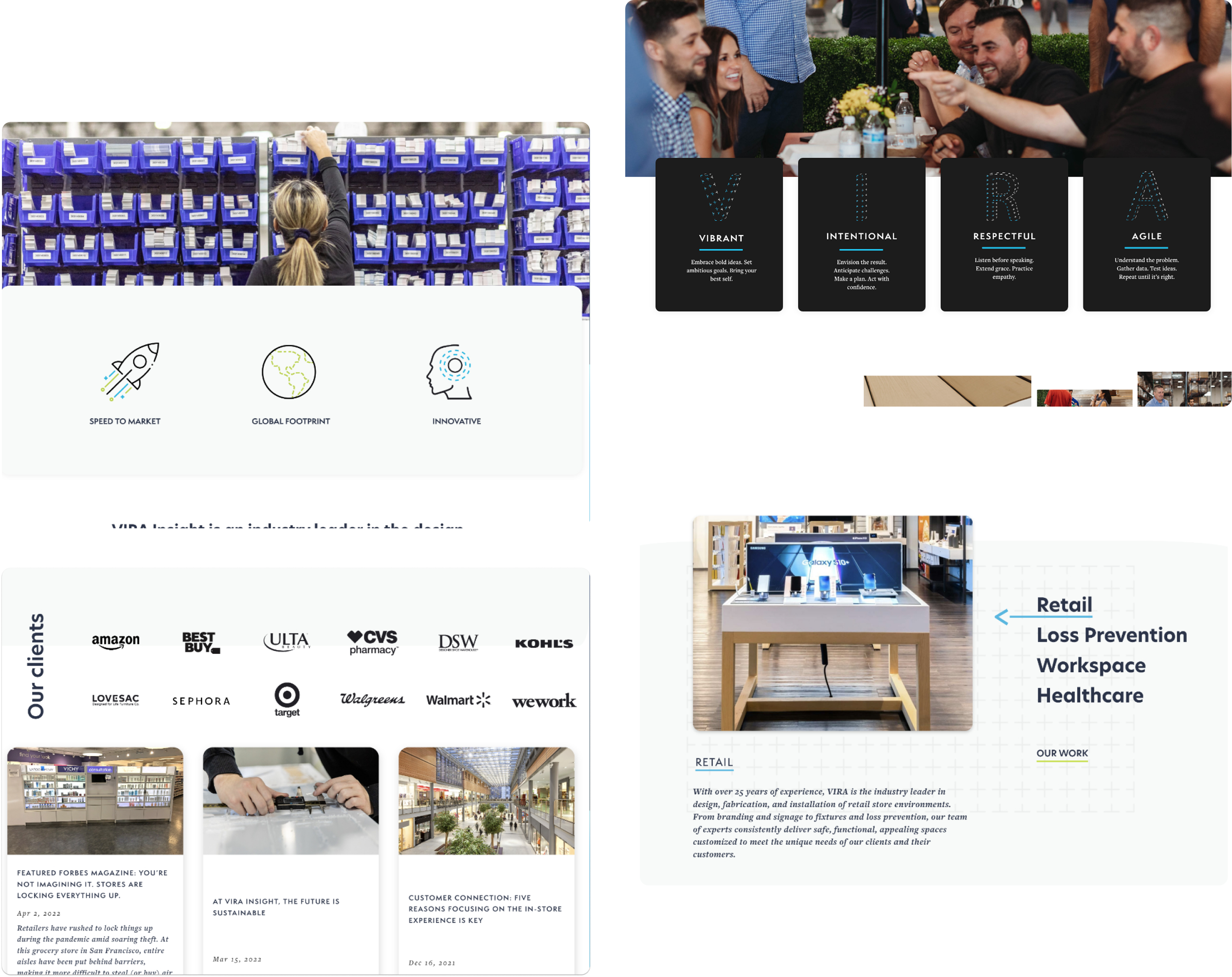
I implemented quick filters, treating each industry category as its own entry point rather than grouping everything into a single list.This structure made it easier to explore relevant projects and understand how VIRA’s capabilities applies across different contexts. This shift helped turn a broad portfolio into a more structured and user friendly experience.

Guided Setup with Clear Progress
Reworked the setup experience to feel more structured and easier to follow. A consistent grid, standardized badges, and a unified icon system (Lucide) improve clarity and make the UI feel more cohesive.
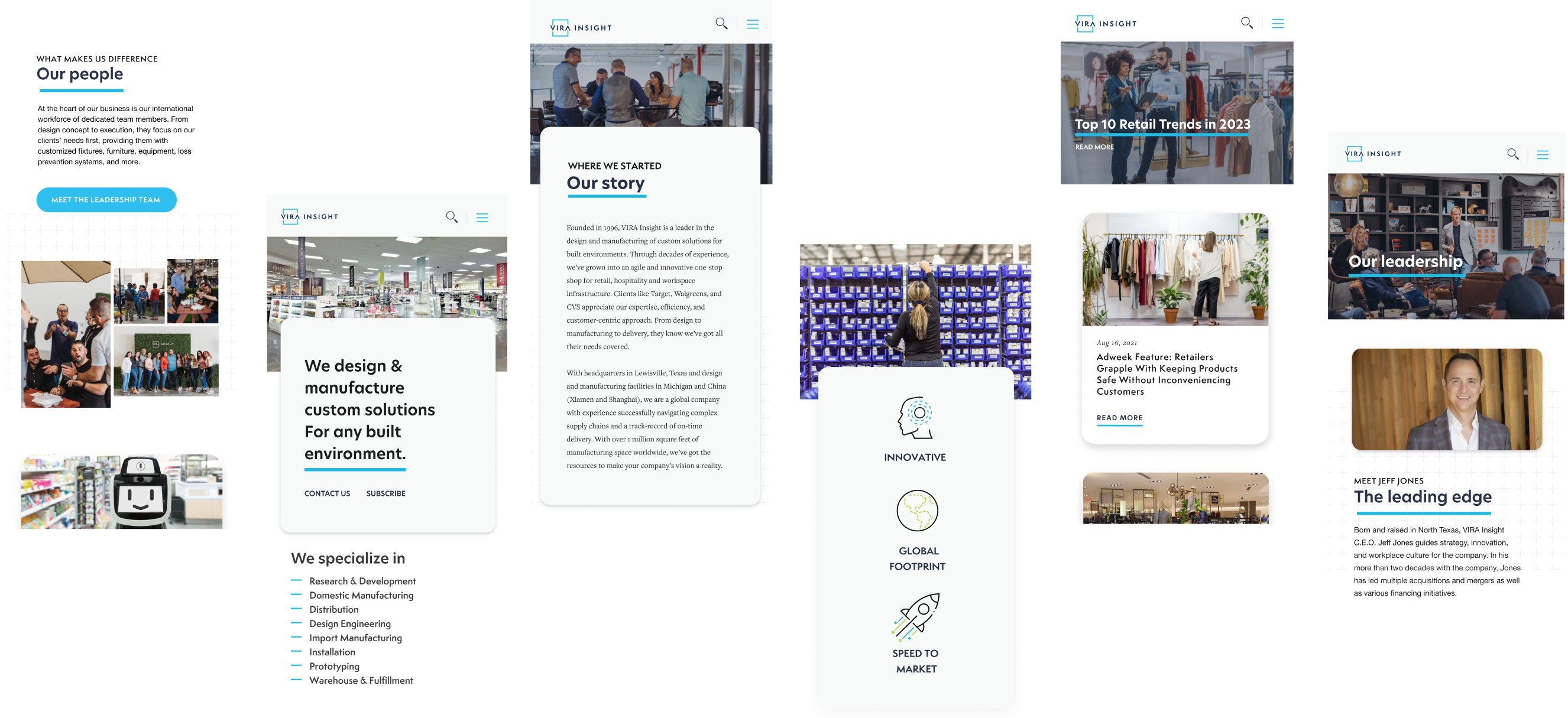
Mobile Screens
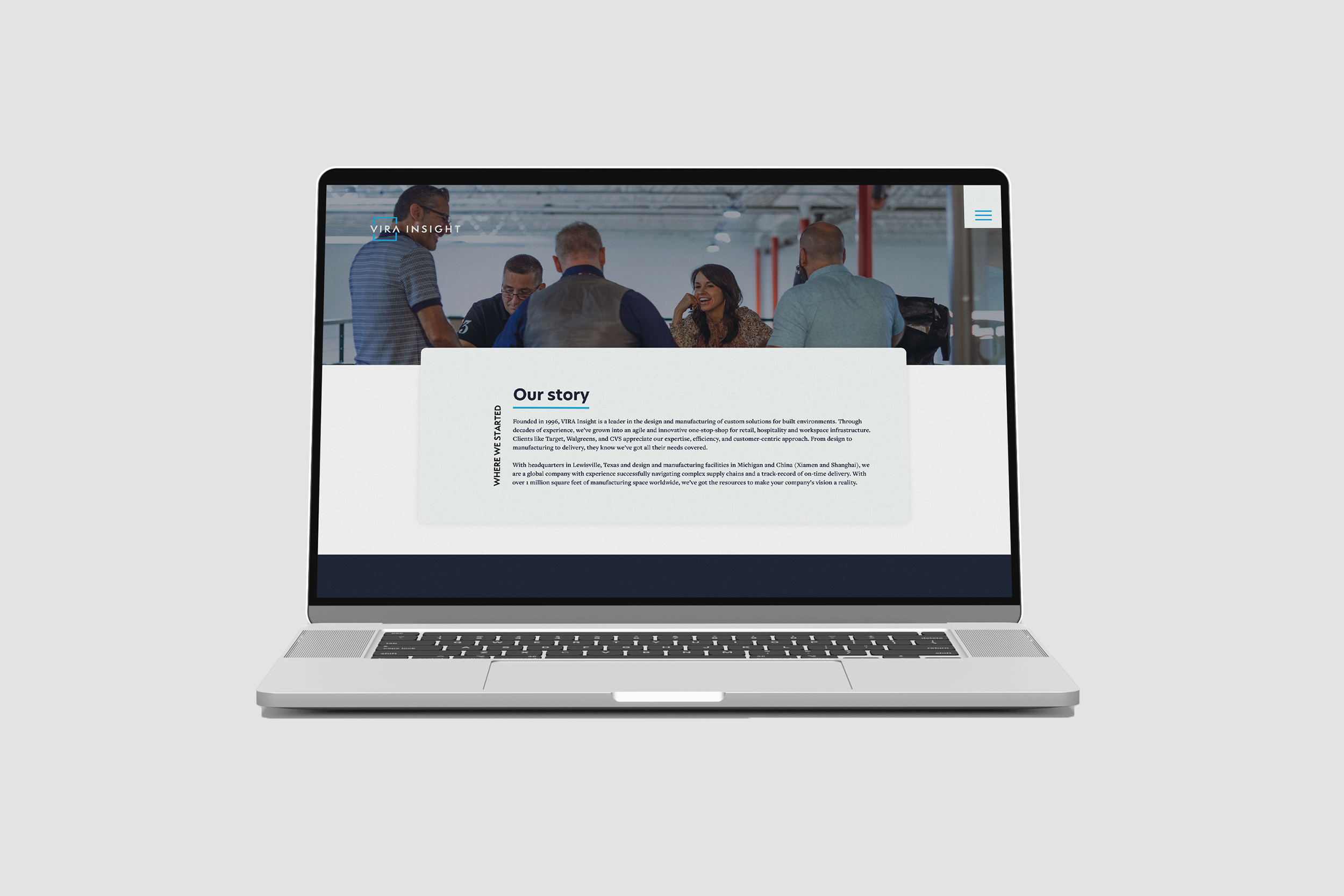
Sections like leadership and company story were restructured to feel more personal and digestible, helping users quickly understand who VIRA is and how they operate—without sacrificing credibility.
More Screens
The new redesign quickly communicate VIRA’s core value proposition and industry expertise. Key capabilities such as global footprint, innovation, and speed to market are presented through icon-based modules to make the information easy to scan.
Key Takeaways
One thing that VIRA has shown me is how essential it is to think not only about usability but positioning as well. The more industries that VIRA entered, the more evident it was that it was crucial for the experience to convey relevance and breadth right off the bat. Designing the portfolio grid has helped me realize that designing isn’t about creating something beautiful but enabling users to understand that it was made for them in order to make finding the relevant information faster and easier.