Client
Practice Fusion
Dashboard
Practice Fusion
Client
Practice Fusion
Year
2024
Scope of Work
UI
Location
Florida
This project focused on redesigning the patient charts experience in Practice Fusion to make it simpler, more structured, and easier to use in day-to-day workflows.I reworked the layout and components to better support how healthcare providers review and act on patient information.
Redesigning the EHR Scheduling Experience
Care staff couldn’t quickly identify which patients required attention. Important signals like status and follow-ups were not immediately visible, forcing users to scan entire rows to determine priority. Messaging was also not accessible from the list view, requiring users to open individual patient charts to initiate communication—slowing down routine follow-ups.
Key Design Decisions
• Prioritized patient identity and status: Rows were restructured to surface identity and status.
• Introduced Status Badge system: Patient statuses were represented with visual badges.
• Standardized actions: Advanced filtering and actions buttons were aligned and positioned across rows.
• Introduced a consistent layout system: A grid and spacing system was applied to bring alignment across screens.
Practice Fusion (Before)
I reviewed the existing UI components and patterns to understand where the experience breaks down.The audit revealed inconsistencies, unnecessary visual noise, and patterns that made the interface harder to scan and use.
Where the UI Breaks Down
I reviewed the existing UI components and patterns to understand where the experience breaks down.The audit revealed inconsistencies amongst components, grid structure that made the interface harder for medical staff to scan and use.

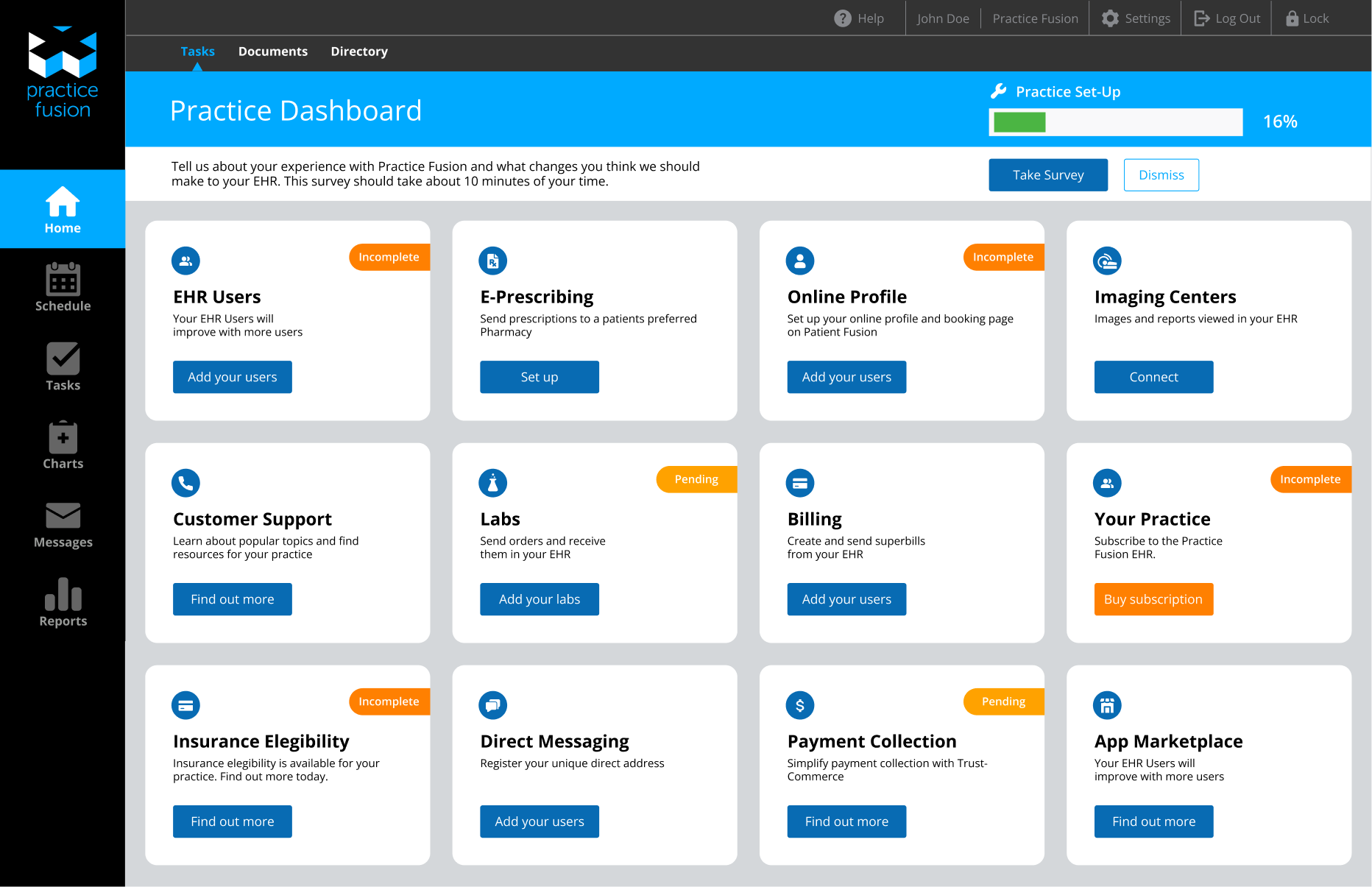
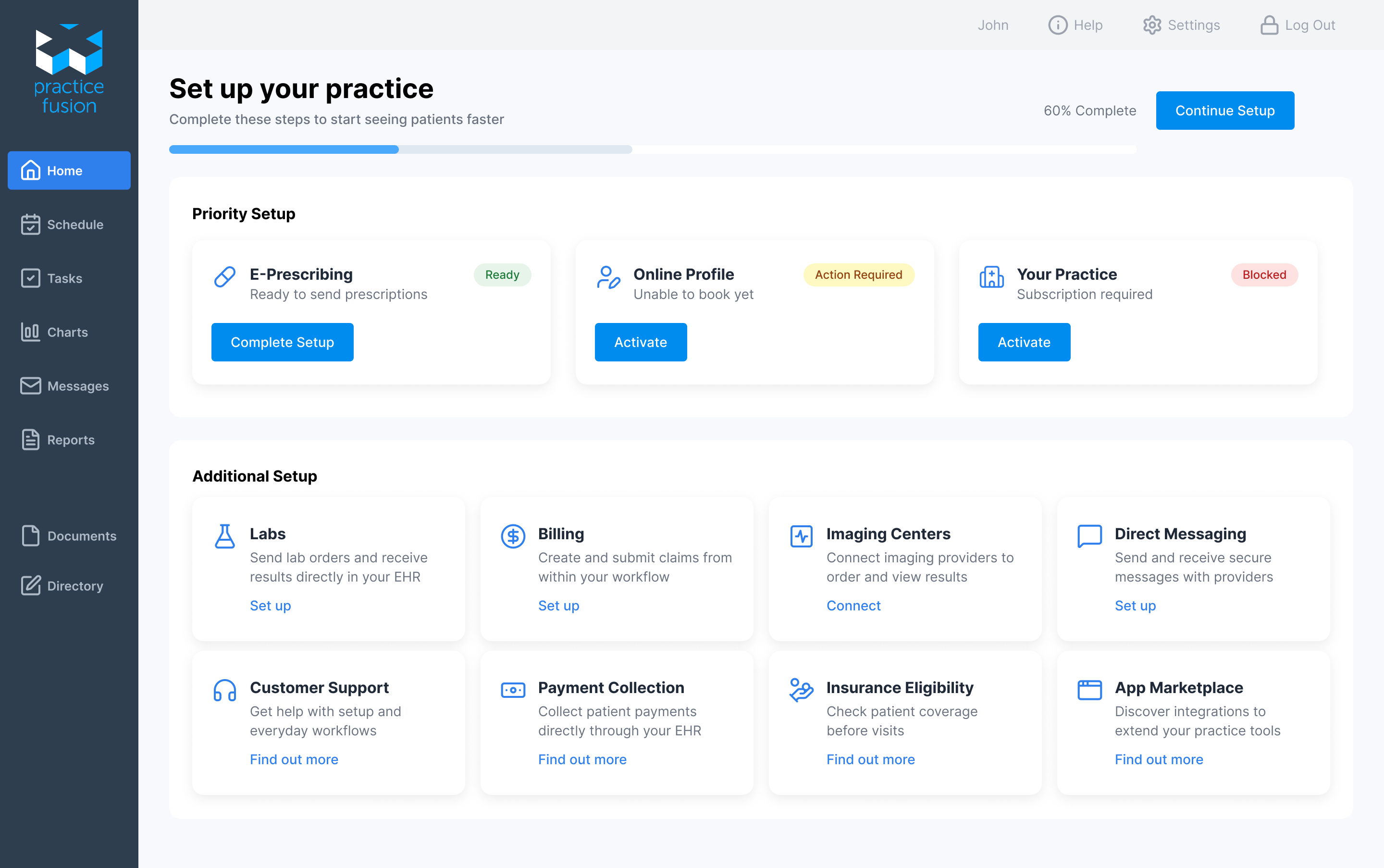
Guided Setup with Clear Progress
Reworked the setup experience to feel more structured and easier to follow. A consistent grid, standardized badges, and a unified icon system (Lucide) improve clarity and make the UI feel more cohesive.
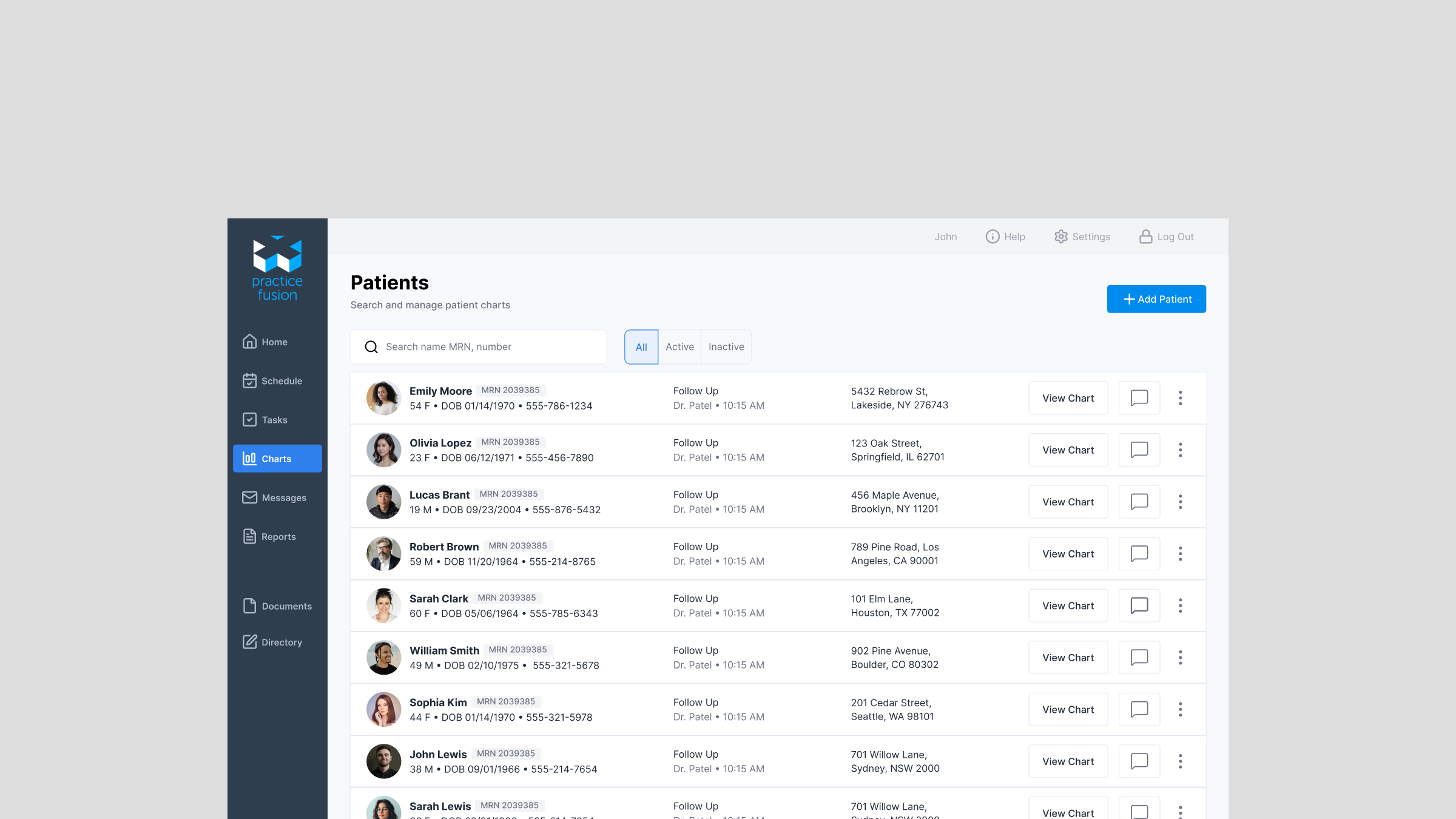
Patient Charts — Simplified for Fast Scanning
Here I made it so critical patient details surface first, reducing lookup time. Moreover, primary actions were placed inline such as messaging and view chart for one-click access.

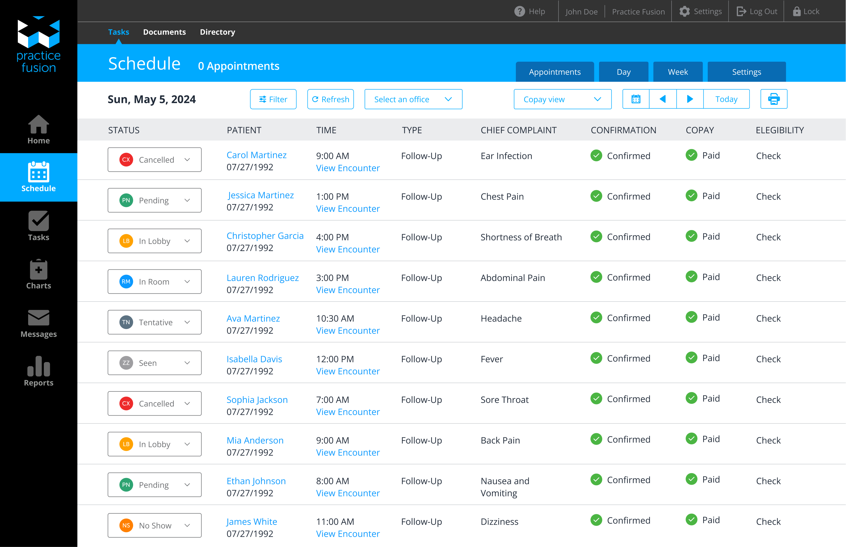
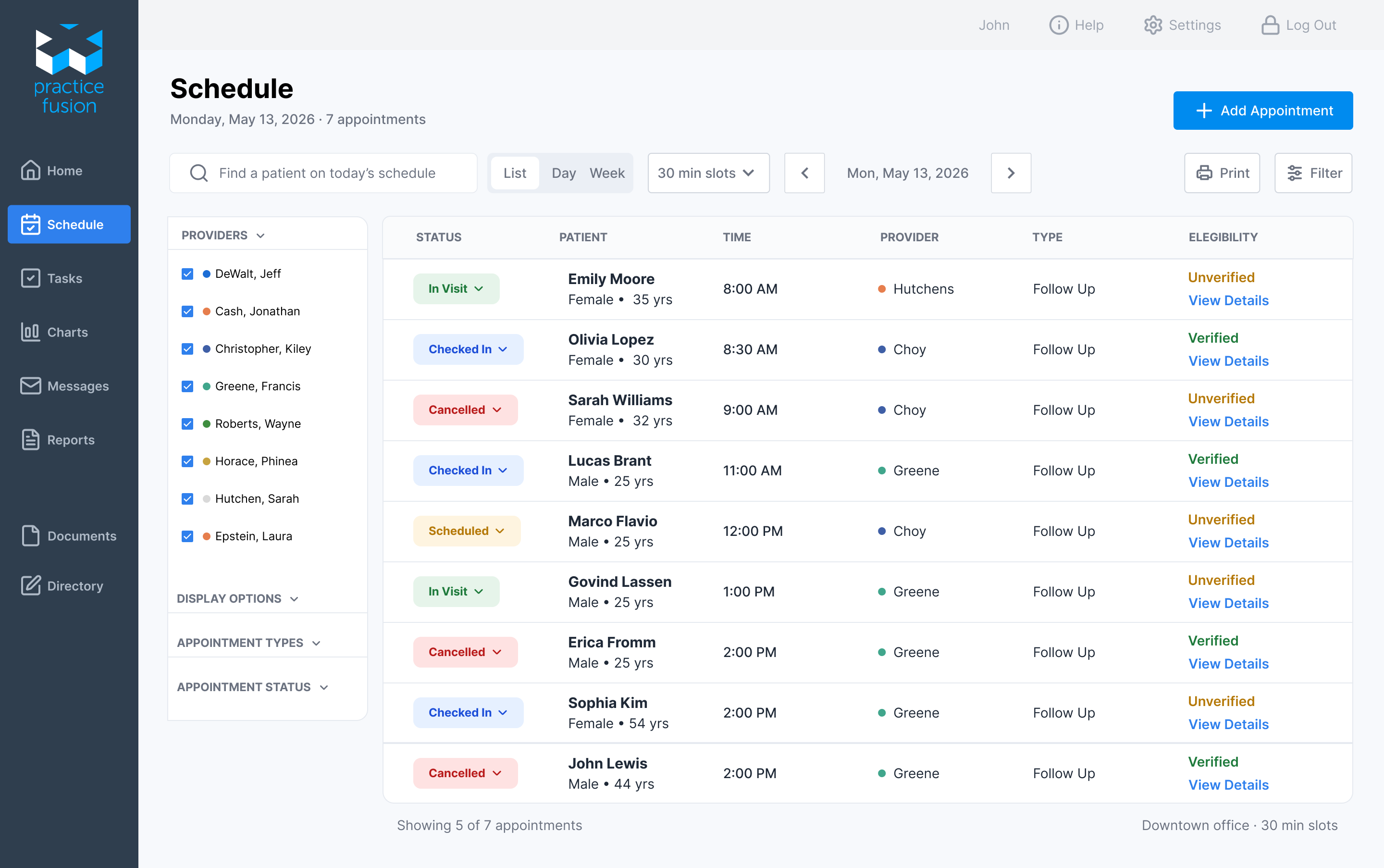
Scheduling with Clear Status and Actions
I improved how appointment status and actions are displayed, making it easier to track patient progress and take the next step without confusion or extra clicks. I left only the most important information and simplified patient metadata to be displayed in one column.
Billing Reports
The original screen was difficult to scan and relied on plain text for key states. I introduced status badges to make important information stand out and move through billing tasks more efficiently.

Key Takeaways
This project made me realize how much small design choices can affect real workflows. What seemed like a simple patient list was actually slowing people down because it wasn’t clear who needed attention, what was urgent, or what to do next. By making those things more visible and cutting down on switching between screens, the experience shifted from searching for information to taking action.